
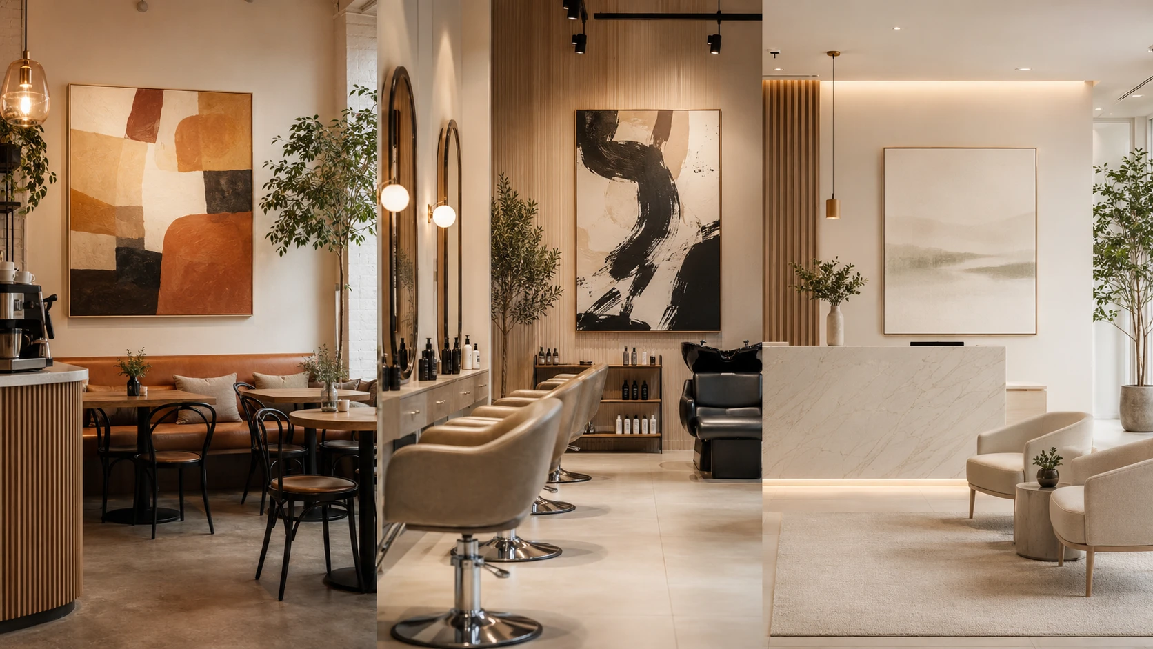
Customers form an impression of a business within seconds of walking in, and the walls do a surprising amount of that talking. In a café, a salon, or a clinic, art is not decoration added at the end — it is part of the brand, working alongside the logo, the colour palette, the furniture, and the staff to tell people what kind of place they have entered. Chosen well, it makes a space feel intentional, memorable, and worth photographing. Chosen carelessly, it sends a mixed message that quietly undermines everything else around it.
The first principle is consistency. The art on the wall should reinforce the same values your brand already claims elsewhere — and, just as importantly, the price point you occupy. A premium clinic with bare, generic walls reads as cheaper than it is, while a budget-friendly café drowning in expensive-looking abstracts can feel pretentious to its own regulars. Before choosing anything, it helps to name the feeling you want visitors to leave with — calm, energised, indulged, reassured — and then treat every piece on the wall as a tool for producing that feeling rather than as filler.
Matching art to the type of space
A café lives and dies by atmosphere and dwell time. People stay longer, return more often, and share photos when a room feels distinctive. A large statement piece behind the counter or along the main seating wall gives the space a focal point and a natural backdrop for social media, which is effectively free marketing. Many cafés also rotate work from local artists, which keeps regulars curious, ties the business to its neighbourhood, and gives staff something to talk about with customers. Scale matters more than quantity here: one confident, well-sized canvas usually reads better than a scatter of small frames. Keep menu boards and signage from competing with the art — let one win each sightline rather than crowding both into the same wall.
Salons and beauty studios sell transformation and aspiration, so the art should feel polished without competing with the clients themselves. The reception and waiting area can carry the bolder, more expressive pieces that set the tone, while the styling stations are usually better kept calmer, because the client and their reflection should be the focus there. Soft organic shapes, abstract work, and a controlled palette tend to photograph well and flatter people in the mirror selfies that inevitably get posted. Because salons are full of reflective surfaces and strong lighting, it is worth checking how a piece looks doubled in the mirrors and under warm light, not just on a plain studio wall.
Clinics — dental, medical, cosmetic, or wellness — have a different job: lowering anxiety. Healthcare and wellness designers consistently lean toward calming imagery, gentle colour, and nature-inspired or softly abstract themes, because a reassuring environment makes waiting feel shorter and visits feel less clinical. It helps to think room by room. A waiting area can be slightly more engaging, giving anxious patients something pleasant to settle on, while treatment rooms should stay very calm and uncluttered. In dental or examination rooms where patients spend time looking up, even the ceiling is worth considering. Busy, jarring, or aggressive images are best avoided everywhere in these settings. The goal is a space that signals competence and care while keeping nervous patients at ease from the moment they sit down.
Across all three, brand colour is the thread that ties the art back to the identity. Because brand colours rarely match a mass-produced print exactly, many businesses commission made-to-order pieces from a hand-painted art studio such as tryartwork.com, where the palette, size, and style can be specified to fit the room and the logo instead of the other way around. A custom canvas in your exact brand tones does more branding work than a generic image ever will, and it gives you something a competitor cannot simply buy off the same shelf.
Where to place the pieces that matter most
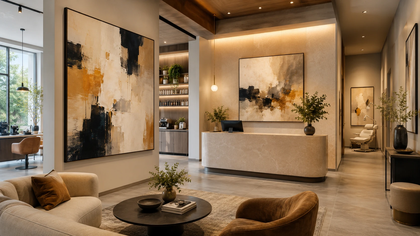
Not every wall deserves the same investment. The smartest approach is to identify the few spots customers actually look at and concentrate the budget there, rather than spreading thin coverage everywhere.
- The entrance and the first sightline from the door set the tone within seconds, so this is where a hero piece earns its keep.
- The reception or counter wall is seen by everyone who pays, waits, or checks in, making it the most valuable surface in the room.
- The waiting or seating area is where people spend the most idle time, so it rewards art that holds up to a long, repeated look.
- Corridors and secondary walls can take quieter, supporting pieces that maintain the mood without demanding attention.
Practical points before you buy
Commercial walls have demands a living room does not, so a few practical checks save money and frustration later.
- Scale the work to the wall, not to the budget: a piece that is too small on a large wall always looks like an afterthought.
- Invest in one strong hero piece rather than many forgettable ones; a single well-chosen canvas anchors a room more effectively than a dozen fillers.
- Plan for cleaning and wear — keep art away from splash zones, steam, heat, and the height where bags and shoulders tend to knock it.
- Favour durable, sealed surfaces; a varnished hand-painted canvas wipes down and ages far better than a paper print in a busy room, which matters most in clinics where hygiene is non-negotiable.
- Choose the right finish for the setting: a framed or gallery-wrapped canvas survives commercial traffic better than thin, unprotected formats.
- Use lighting deliberately, since the right warm or neutral light can make colours sing, while poor light leaves them flat and grey.
- Keep a cohesive thread — a shared palette, medium, or mood — so separate pieces read as one collection rather than a random mix.
Common mistakes to avoid
Most branding failures on the wall come down to a handful of recurring errors.
- Hanging instantly recognisable stock images that customers have seen in a dozen other businesses, which makes a brand feel generic.
- Letting the art fight the brand colours instead of reinforcing them, so the room feels subtly off without anyone knowing why.
- Chasing a short-lived trend that will look dated long before the next refurbishment, rather than choosing something with staying power.
- Treating art as the very last line of the budget, then filling premium walls with whatever was cheapest and available.
Finally, treat the art as part of the experience you are selling, not as a last-minute finishing touch. A café that invests in one striking, well-lit canvas, a salon whose walls quietly echo its brand colours, and a clinic that chooses calm over clutter are all using the same simple idea: every surface a customer sees is a chance to say who you are. When the art agrees with the brand — in colour, in mood, and in quality — the whole space feels coherent, and coherence is exactly what people remember, photograph, and come back to trust.
 Ask Norvain Velmyre how they got into customer engagement techniques and you'll probably get a longer answer than you expected. The short version: Norvain started doing it, got genuinely hooked, and at some point realized they had accumulated enough hard-won knowledge that it would be a waste not to share it. So they started writing.
What makes Norvain worth reading is that they skips the obvious stuff. Nobody needs another surface-level take on Customer Engagement Techniques, Digital Marketing Essentials, Effective Branding Strategies. What readers actually want is the nuance — the part that only becomes clear after you've made a few mistakes and figured out why. That's the territory Norvain operates in. The writing is direct, occasionally blunt, and always built around what's actually true rather than what sounds good in an article. They has little patience for filler, which means they's pieces tend to be denser with real information than the average post on the same subject.
Norvain doesn't write to impress anyone. They writes because they has things to say that they genuinely thinks people should hear. That motivation — basic as it sounds — produces something noticeably different from content written for clicks or word count. Readers pick up on it. The comments on Norvain's work tend to reflect that.
Ask Norvain Velmyre how they got into customer engagement techniques and you'll probably get a longer answer than you expected. The short version: Norvain started doing it, got genuinely hooked, and at some point realized they had accumulated enough hard-won knowledge that it would be a waste not to share it. So they started writing.
What makes Norvain worth reading is that they skips the obvious stuff. Nobody needs another surface-level take on Customer Engagement Techniques, Digital Marketing Essentials, Effective Branding Strategies. What readers actually want is the nuance — the part that only becomes clear after you've made a few mistakes and figured out why. That's the territory Norvain operates in. The writing is direct, occasionally blunt, and always built around what's actually true rather than what sounds good in an article. They has little patience for filler, which means they's pieces tend to be denser with real information than the average post on the same subject.
Norvain doesn't write to impress anyone. They writes because they has things to say that they genuinely thinks people should hear. That motivation — basic as it sounds — produces something noticeably different from content written for clicks or word count. Readers pick up on it. The comments on Norvain's work tend to reflect that.