I know what it’s like to need a logo but have zero budget for it.
You’re building something real. A business. A project. A brand. But hiring a designer costs hundreds (sometimes thousands) of dollars. And you’re not ready to spend that yet.
Here’s the thing: you don’t have to.
I’m going to show you how to create a professional logo for free that actually looks good. Not some clipart mess that screams “I made this in five minutes.”
This isn’t just a list of free tools. You’ll learn the brand fundamentals that matter. The design principles that separate amateur logos from ones that look like you paid for them.
I’ve helped businesses in Los Angeles and beyond build their brands from scratch. I’ve seen what works when you’re starting with nothing but an idea and a free Canva account.
You’ll get a clear process. The kind where you actually understand why you’re making each choice instead of just clicking random buttons and hoping it looks decent.
By the end, you’ll have a logo you’re proud to put on your website, your business cards, and your social media. One that doesn’t look free.
No design degree required. Just follow the steps.
Step 1: The 5-Minute Brand Foundation (Before You Design)
Here’s what most people get wrong.
They open Canva or whatever tool they’re using and start dragging shapes around. Maybe they pick a font that looks cool. Slap their business name on it.
Then they wonder why their logo feels off.
I’m going to be blunt. Your logo isn’t the problem. Your lack of direction is.
A logo without a clear brand identity behind it is just decoration. It won’t connect with anyone because it doesn’t stand for anything.
Start with your brand keywords. Write down three to five words that capture what you’re about. Bold. Minimal. Playful. Trusted. Whatever fits.
This isn’t busywork. These words become your filter for every design choice you make.
Next, get specific about who you’re talking to. A law firm and a kids’ toy store need completely different visual languages. If you skip this step, you’ll end up with something generic that tries to please everyone and connects with no one.
Now here’s the part that actually makes a difference.
Build a simple mood board. Grab five to ten images that feel right. Colors you like. Textures that match your vibe. Logos you admire (even if they’re from different industries).
This becomes your design compass. When you’re stuck between two fonts or color schemes, you check the mood board. Does it fit? Yes or no.
I know this sounds basic. But I’ve seen too many people skip straight to design and waste hours second-guessing themselves.
Five minutes of foundation work saves you from that spiral.
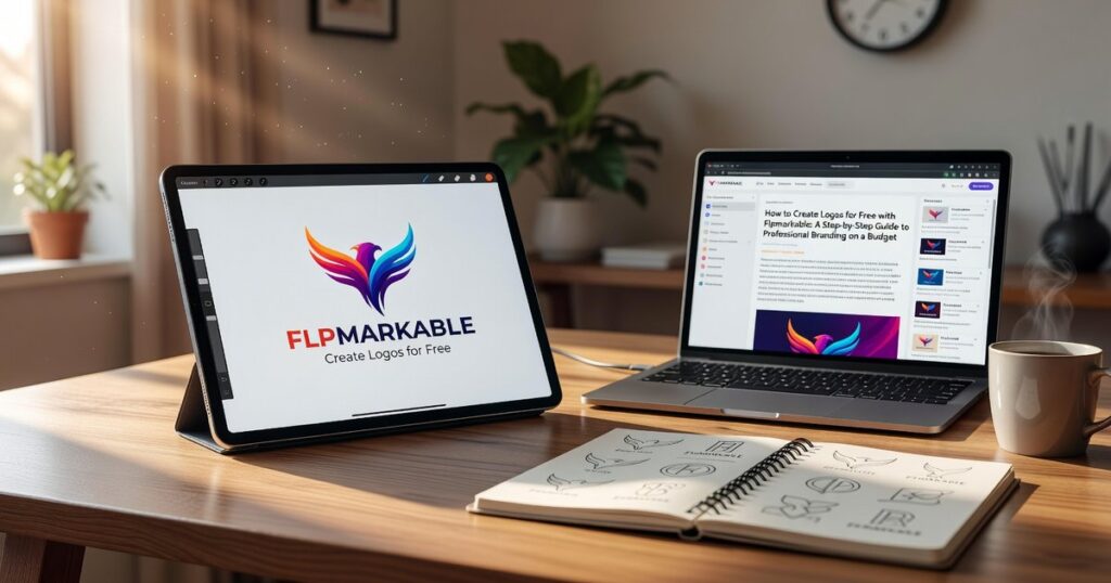
If you want to how to create logos for free flpmarkable has the resources you need. But even with the best tools, you need this foundation first.
Your brand keywords, your audience, and your mood board. That’s it.
Get these right and the actual design becomes way easier.
Step 2: Choosing the Right Free Online Logo Maker
You’ve got your brand direction figured out.
Now comes the part where most people get overwhelmed. Which tool should you actually use?
I’ve tested dozens of free logo makers. Most of them fall into two camps: either they’re so basic you can’t make anything decent, or they’re so complicated you need a design degree just to export a file.
But a few stand out.
Let me walk you through the three I recommend and when each one makes sense for your project.
Canva Logo Maker is where I tell most people to start. The interface is clean and you can figure it out in about five minutes. They’ve got thousands of templates and fonts that don’t look like they came from 2005.
The downside? It’s almost too easy to slap together something generic. If you’re not careful, you’ll end up with the same logo as fifty other businesses in your niche.
Adobe Express brings more professional design assets to the table. The fonts are better and you get access to tools that help keep your branding consistent across different materials. That matters more than you’d think.
The catch is the learning curve. It’s not terrible but it takes longer to get comfortable than Canva does.
Then there’s Looka’s free editor. This one uses AI to generate suggestions based on your preferences. It’s actually pretty smart about giving you starting points you wouldn’t have thought of yourself.
Here’s the thing though. The free version lets you play around and test ideas, but if you want high-resolution files you’ll need to pay. Still worth using for the idea generation alone.
So which one should you pick?
If you’re just getting started with how to create logos for free flpmarkable and want something that won’t frustrate you, go with Canva. Just promise me you’ll actually customize the templates instead of using them straight out of the box.
If you’ve got some design experience or you’re building a brand that needs to look polished from day one, Adobe Express is your better bet.
And if you’re stuck on ideas? Spend twenty minutes in Looka just to see what the AI suggests. You might find a direction you hadn’t considered.
The tool matters less than what you do with it. I’ve seen incredible logos come out of all three platforms and terrible ones too.
What makes the difference is understanding your brand (which you did in Step 1) and taking the time to make something that actually represents what you’re building.
Step 3: The Design Process – From Blank Canvas to Brand Mark

You know that moment in The Devil Wears Prada when Miranda Priestly breaks down the entire fashion industry’s influence on Andy’s cerulean sweater?
That’s what good design does. Every choice matters.
Now here’s where most people mess up. They open Canva or Figma and try to throw everything at their logo at once. Complex icon. Fancy script. Five different colors. The works.
It looks like a MySpace page from 2006.
Some designers will tell you that complexity shows sophistication. That a “rich” design with multiple elements proves you’re serious about your brand.
I disagree.
The logos you remember? Apple. Nike. Target. They’re almost boring in their simplicity. And that’s exactly why should logos be simple flpmarkable principles work so well.
Selecting Your Core Elements
Start with a choice. Icon or wordmark.
Not both at first. Pick one and make it work.
If you go with an icon, keep it clean. Think about what one shape or symbol represents your brand. A wordmark means your company name becomes the logo itself (like Google or Coca-Cola).
Don’t combine a complex icon with complex text. That’s how you end up with something nobody can read at thumbnail size.
Mastering Typography
Here’s my rule. Two fonts maximum.
One for headlines. One for body text. That’s it.
Pick a clear, readable headline font that has personality. Then pair it with something simple that won’t fight for attention. Google Fonts has pairing suggestions built right in if you’re stuck.
When you’re learning how to create logos for free flpmarkable style, typography does half the heavy lifting. Get this right and you’re already ahead of most DIY logos out there.
Strategic Color Selection
Grab a color psychology chart. Match 1-2 primary colors to your brand keywords.
Professional? Try navy or charcoal. Creative? Maybe teal or purple. Energetic? Red or orange.
Then use Coolors.co to find complementary accent colors. The tool does the math for you so your palette actually works together instead of looking like a kindergarten art project.
Achieving Balance and Spacing
White space isn’t wasted space. It’s breathing room.
Your logo shouldn’t feel cramped. If elements are touching or crowding each other, pull them apart. Use alignment tools in whatever software you’re working with to make sure everything lines up perfectly.
Pro tip: Zoom out to 25% and see if your logo still makes sense. If it’s a blob of confusion, you need more space between elements.
Center everything that should be centered. Align everything that should align. It sounds basic but I see off-center logos every single day and they bug me more than they should.
The goal? Someone should be able to glance at your logo for two seconds and get it. No squinting. No confusion.
Just clean, clear design that does its job.
Step 4: Avoiding Common Pitfalls of Free Logos
Some designers will tell you that free logo templates are worthless.
They’ll say you should never touch them because you’ll end up looking like everyone else.
I disagree.
The problem isn’t the template. It’s how you use it.
Here’s what actually trips people up when they how to create logos for free flpmarkable.
The Template Trap
Never use a template as-is. Your competitors might be using the same one (and probably are). Change the colors, fonts, and layout. Make it yours.
Overly Complex Designs
Think about Apple. Think about Nike.
Simple works. A complex logo is hard to remember and doesn’t scale well on small screens. If your logo needs a magnifying glass to make sense on mobile, you’ve lost.
Poor Font Choices
Avoid Comic Sans. Avoid fonts that look like they belong on a birthday invitation. If people have to squint to read your business name, pick something else.
Ignoring File Types
Always download your final logo as a PNG with a transparent background. This is the most versatile format for websites, social media, and documents.
You need flexibility. A white background box around your logo looks amateur on anything that isn’t white.
Your Professional Logo is Ready
You came here wondering if you could actually create a logo without spending money.
You can.
I’ve shown you the complete process from blank canvas to finished design. The tools exist and they’re free.
The real obstacle wasn’t the budget. It was the fear of looking amateur.
Here’s why this approach works: You started with brand strategy before touching any design tool. You applied basic design principles that professionals use. That combination turns free software into something that produces real results.
Most people skip the strategy part. They jump straight into a logo maker and wonder why everything looks generic.
You’re not doing that.
How to create logos for free flpmarkable comes down to following a process. Define your brand first. Choose the right tool for your skill level. Apply the principles I outlined. Iterate until it feels right.
Stop waiting for a design budget that might never come.
Open Canva or Inkscape right now. Follow the steps in this guide. Start building your brand’s visual identity today.
Your business needs a face. You have everything you need to create it. Homepage.