I’ve reviewed hundreds of library logos over the years and most of them look exactly the same.
You’re probably redesigning your library’s logo because the current one feels tired. Or maybe you’re starting fresh and don’t want to fall into the same trap as everyone else.
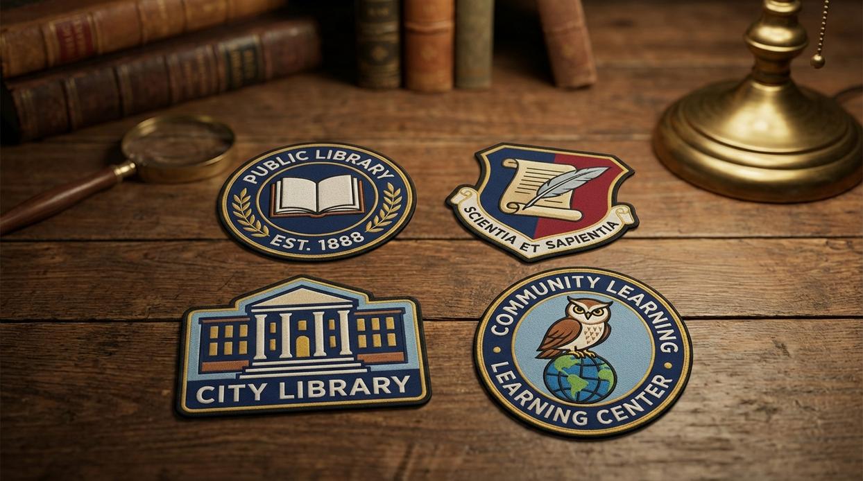
Here’s the problem: too many libraries default to an open book or a building silhouette. These symbols don’t tell your story. They don’t show what makes your library different from the one across town.
Your library is more than books now. It’s a community space. A tech hub. A place where people connect and learn in ways that didn’t exist twenty years ago.
This guide walks you through how to create a logo that actually reflects that reality.
I’m coming at this from a brand strategy angle. Not just what looks nice but what works in the real world. What makes people remember you and feel connected to what you do.
You’ll learn the core principles that separate forgettable logos from ones that stick. I’ll show you how to move past the clichés and find concepts that are both modern and meaningful.
No design degree required. Just a willingness to think differently about what your library represents.
The Foundation: Core Principles of Effective Logo Design
Most library logos I see around LA make the same mistake.
They try to cram everything into one mark. Books, computers, columns, globes, and maybe a torch for good measure.
It doesn’t work.
A good logo does one thing well. It creates a clear visual that people remember.
Here’s what actually matters when you’re building a logo for your library.
The Four Principles That Work
1. Keep it simple
The best library logos flpmarkable are the ones you can sketch from memory. Think about it. Can your patrons draw your logo after seeing it once? If not, you’ve got too much going on.
Strip out the extras. One strong concept beats five weak ones every time.
2. Make it relevant
Your logo needs to match what your library actually does. A children’s library in Pasadena shouldn’t look like a law library downtown. They serve different people with different needs.
Are you a historical archive? Show that. A makerspace with 3D printers? That’s a different story entirely.
3. Build for memory
People should recognize your logo without reading the name. That’s the test.
Unique shapes help. So do clever concepts that connect to what you do. But don’t get too abstract or you’ll lose people.
4. Design for every size
Your logo appears everywhere. On the side of your building. On bookmarks. In browser tabs. On social media posts.
It needs to work at all those sizes. And it needs to work in black and white too (because sometimes that’s all you get).
Test it small. If you can’t tell what it is at favicon size, go back and simplify.
Want more guidance on building a brand that actually connects? Check out flpmarkable for strategies that work in the real world.
Conceptual Directions: Moving Beyond the Obvious
Most designers will tell you to start with a book.
Makes sense, right? You’re designing for a library. Slap a book icon on there and call it a day.
But that’s exactly the problem.
When every library uses the same visual language, nobody stands out. Your logo becomes wallpaper. People see it but they don’t really see it.
I’ve worked with enough brands to know that the obvious choice is rarely the right one.
Some designers push back on this. They say people need to instantly recognize what you do. If you’re a library, show books. Otherwise, you’re just confusing your audience.
Fair point. There’s real value in being clear about what you offer.
But here’s what that argument misses. Your audience already knows you’re a library. They’re not wandering in off the street wondering what building they just entered.
What they don’t know is what makes you different.
The Community Hub Concept works because it shifts the focus. Instead of showing what you have (books), you show what you create (connection). Think abstract shapes that suggest gathering or conversation. Interconnected nodes that represent people coming together.
It’s about the experience, not the inventory.
The Knowledge & Growth Concept takes a different angle. Trees, sprouting seeds, rays of light. These symbols tap into something deeper than just information storage. They represent transformation.
Because that’s what really happens in libraries. People grow.
Now, The Architectural Icon Concept is interesting. You take something unique about your actual building and turn it into a minimalist graphic. This creates a sense of place that no other library can copy (because they don’t have your building).
For libraries leaning into technology, The Digital Gateway Concept makes sense. Subtle pixels, cursors, or Wi-Fi waves signal that you’re not stuck in the past. You can check out more approaches at flpmarkable free logos by freelogopng if you want to see how different visual strategies play out.
Then there’s The Abstract Mark Concept.
This one scares people. You’re creating a completely unique symbol that represents values like curiosity or discovery without being literal about it.
The pushback I hear most often? “Nobody will understand it.”
But think about Nike’s swoosh or Apple’s apple. Those don’t literally show you what the company does. They work because they’re memorable and they mean something to the people who interact with them.
Your library logo doesn’t need to explain everything. It needs to be recognizable and meaningful to your community.
That’s a different goal entirely.
The Building Blocks: Typography, Color, and Iconography
Let’s talk about the stuff that makes or breaks your logo.
You know that feeling when you see a logo and it just clicks? That’s not magic. It’s typography, color, and iconography working together like a well-rehearsed band (minus the creative differences and tour bus drama).
Typography sets the mood before anyone reads a word.
Serif fonts are the ones with those little feet on the letters. Think Times New Roman. They feel traditional and authoritative. Like your logo went to law school and has opinions about wine.
Sans-serif fonts? No feet. Clean lines. They’re modern and approachable. The kind of font that would help you move apartments without complaining.
Pick something legible. I’ve seen too many library logos flpmarkable where the font is so stylized you need a decoder ring to read it.
Now let’s talk color psychology.
Blue screams trust and intelligence. That’s why every tech company and their mother uses it. Green suggests growth and calm. Warm colors like orange or yellow bring energy and warmth.
But here’s the catch. You’re not picking your favorite color. You’re picking the color that makes people feel what you want them to feel about your brand.
Then there’s the structure question.
A wordmark is just your name in a styled font. Simple. Elegant. Google does this.
A logomark is pure symbol. The Nike swoosh. The Apple apple. These work great once people know who you are (not so much when you’re starting out).
A combination mark gives you both. Name plus symbol. It’s the most flexible option and honestly where most people should start. You get recognition from the text while building association with your symbol.
Check out the free logo library flpmarkable if you want to see how different brands handle these choices.
Pick your building blocks carefully. They’re doing more work than you think.
Common Pitfalls and How to Avoid Them
You’ve seen them before.
Those logos that make you squint at your screen. The ones that look like someone threw every design element into a blender and hoped for the best.
I’m talking about the open book with a lightbulb inside it. Or the generic silhouette of a person reading. You know the ones.
They blur together in your mind because they all look the same.
The Problem With Playing It Safe
Here’s what happens when you go too literal. Your logo becomes invisible. Not because it’s bad, but because it’s forgettable.
Think about scrolling through your phone. How many app icons can you actually remember? The ones that stick are simple. They have a shape or color that hits you immediately.
But then there’s the other extreme.
Some designers pack everything in. Gradients that shift from blue to purple to gold. Tiny details that look great on a 27-inch monitor but turn into mush on your phone screen. I’ve watched clients zoom out on their logo mockup and realize they can’t tell what it is anymore.
That sinking feeling? It’s real.
You can’t read flpmarkable when it’s the size of a favicon. All those careful details just disappear.
Now let’s talk about trends. Remember when everyone used that geometric sans-serif font? Or when every tech company had a flat, minimalist wordmark?
Those logos already feel tired.
What felt fresh two years ago now screams “I designed this in 2022.” You want something that’ll work in five years. Ten years, even.
The truth is, your logo needs to work everywhere. Not just on your website header.
Picture it as a tiny circle next to your tweets. As a square app icon sitting between Instagram and TikTok. As a small stamp in the corner of a PDF.
If your logo only works in one format, you’ll end up creating five different versions. And then you’ll have to remember which one to use where (trust me, you won’t).
Test it small. Test it square. Test it against a busy background.
If it still works, you’re onto something.
Your Logo is Your Library’s Signature
We’ve walked through the core principles and creative concepts that make library logos work.
You know what happens with a generic logo. It sits there doing nothing while your library does everything for the community.
People walk past without noticing. They don’t feel the pull to come inside.
Here’s the fix: Focus on a unique concept that reflects what makes your library different. Apply solid design principles. You’ll end up with a brand identity that people recognize and remember.
A strong logo invites people in before they even reach the door.
Start by defining your library’s core mission. What do you stand for? What role do you play in people’s lives? Answer those questions first.
That’s your foundation. Everything else builds from there.
Your logo should tell your library’s story at a glance. Make it count.
Ready to create something that represents your library the way it deserves? Begin with your mission and let the design follow.
library logos flpmarkable gives you the framework to build a visual identity that actually works for your community. Homepage.