Let me start with a simple truth I’ve seen repeated over and over in my 10+ years helping entrepreneurs launch websites: people don’t judge websites by how hard they were to make, but by how easy they are to use.
You can spend weeks coding something from scratch, or you can generate a beautiful, functional site in minutes with AI. If the end result confuses your visitors, loads slowly, or looks amateurish, they’ll leave — often for good. So let’s talk about what really matters when it comes to building a visitor-friendly website — and how you can achieve it even without a tech background.
What Makes a Website Truly “Visitor-Friendly”?
When I consult startups or small business owners, I ask one question: “What do you want people to feel when they visit your site?” Most say something like “It should be easy to understand, look good, and make people trust us.” That’s a perfect summary.
Visitor-friendliness is about clarity, speed, trust, and relevance. Here’s what that means in practice:
1. Clear Navigation
Your visitor should know where they are, what they can do next, and how to do it — without thinking. Use simple menus, clear headings, and obvious buttons. Don’t make people guess.
2. Fast Load Time
Speed matters. A delay of even one second can hurt conversions. Use compressed images, avoid bloated plugins, and choose fast hosting.
3. Mobile Optimization
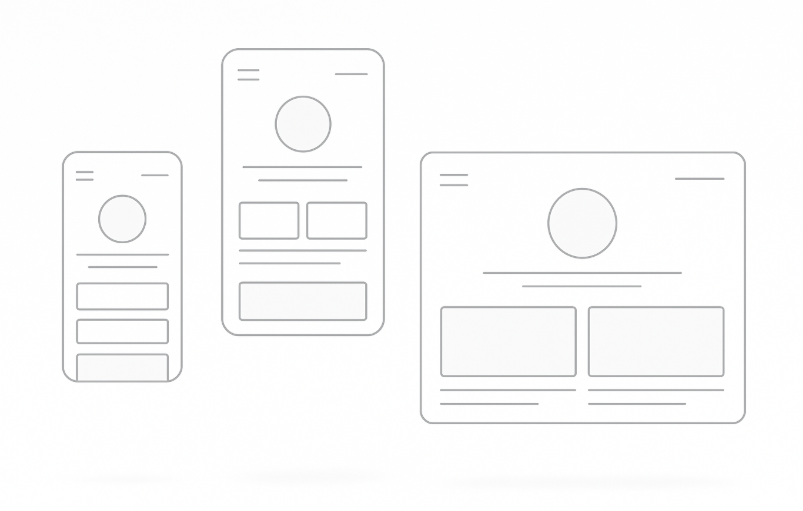
More than half your traffic is likely mobile. If your site doesn’t adapt to smaller screens, you’re losing users instantly. Every button, text block, and image should scale cleanly.
4. Consistent Visual Design
A clean, professional-looking design helps users feel that your business is credible. Stick to a clear color palette, readable fonts, and well-spaced sections.
5. Relevant Content
Speak your visitor’s language. Get to the point. Answer their questions. Use real examples. Avoid jargon. Update outdated content regularly.
6. Clear Calls-to-Action (CTAs)
Don’t assume users will know what to do. Whether it’s “Get a Quote,” “Try for Free,” or “Contact Us,” your CTA should be visible, simple, and action-driven.
Why Many Websites Fail — And How to Avoid It
Here’s something I’ve seen repeatedly: a beautiful website that looks great, but gets no traction. Why? Because it’s designed for the owner, not the visitor.
Your job isn’t to impress yourself — it’s to guide your users quickly to value.
Let me share a quick example. One business owner I worked with had five sections about company history… but no clear CTA on the homepage. Visitors were reading, scrolling, and then leaving.
We restructured it with a 3-second pitch, a visual of the product, and a “Get Started” button. Engagement tripled.
Visitor-friendly means visitor-first.
The Fastest Way to Build a Visitor-Friendly Website (Without Hiring a Developer)
If you’re like most entrepreneurs, you want your website up yesterday. You want to focus on your product or service, not wrangle code or fiddle with endless design decisions.
That’s why AI website generators have exploded.
These tools let you describe your business in plain language, and they create a site structure, fill in content, and apply design rules instantly. One of the tools I’m particularly proud of is our own Turbologo Website Generator.
Here’s how it works:
- You write a short description of your business.
- Our AI selects the best layout, generates relevant text and visuals.
- You get a ready-to-publish website in minutes — responsive, editable, and clean.
Whether you’re building a landing page, MVP, portfolio or blog, this saves days of work. You can even create a logo for your website using our AI logo maker and integrate it seamlessly.
It’s ideal for small businesses, freelancers, marketers — and especially helpful for startups testing new ideas.
Expert Tip: Start With a Hypothesis
Before you build anything, answer this: What do I want people to do on my site?
Download something? Book a call? Buy a product? Every design decision should support that goal.
Then ask: What do my visitors want to know before they take that action?
That’s your content roadmap. Build backwards from that.
Don’t try to say everything. Try to say the right things, in the right order.
Common Pitfalls to Avoid
- Overcomplicating your homepage: Keep it focused. One value proposition, one CTA.
- Ignoring mobile users: Test your site on real devices, not just in a browser.
- Writing vague headlines: Be specific. “Increase your sales in 3 weeks” beats “We help businesses grow”.
- Too many fonts or colors: Choose one or two of each and stick to them.
- Missing SEO basics: Use page titles, meta descriptions, and structure (H1, H2, H3) logically.
Frequently Asked Questions
Q: How long does it take to build a visitor-friendly site with Turbologo?
A: About 5–15 minutes, depending on how much content you want to customize.
Q: Can I use my own domain name?
A: Yes. On the Business plan, you can connect your domain, remove branding, and access SEO tools.
Q: Do I need design skills?
A: Not at all. The system auto-generates design layouts. You can tweak them visually, no code needed.
Q: Will my site work on mobile and tablets?
A: Absolutely. All sites are responsive by default.
Q: Is there a free plan?
A: Yes. You can build and publish sites on a Turbologo subdomain, with basic features included.
Final Thoughts: Simplicity Wins
You don’t need to reinvent the wheel. The best websites aren’t always the most complex — they’re the most usable.
As someone who’s worked with thousands of logos and brands, I can tell you: when your site makes a good first impression, everything else becomes easier — sales, trust, retention.
Use tools that let you move fast, adapt easily, and focus on what matters: your message and your visitors.
If you’re ready to try it for yourself, give the Turbologo website generator a spin. You might be surprised how far you can get in 15 minutes.
Good luck — and build something great.
Written by Mikhail Khomutetskiy — founder of Turbologo, designer, and expert in AI branding tools. 10+ years helping businesses launch visual identities and no-code digital products.
 Angelo Reynoldsick has opinions about expert insights. Informed ones, backed by real experience — but opinions nonetheless, and they doesn't try to disguise them as neutral observation. They thinks a lot of what gets written about Expert Insights, Effective Branding Strategies, Customer Engagement Techniques is either too cautious to be useful or too confident to be credible, and they's work tends to sit deliberately in the space between those two failure modes.
Reading Angelo's pieces, you get the sense of someone who has thought about this stuff seriously and arrived at actual conclusions — not just collected a range of perspectives and declined to pick one. That can be uncomfortable when they lands on something you disagree with. It's also why the writing is worth engaging with. Angelo isn't interested in telling people what they want to hear. They is interested in telling them what they actually thinks, with enough reasoning behind it that you can push back if you want to. That kind of intellectual honesty is rarer than it should be.
What Angelo is best at is the moment when a familiar topic reveals something unexpected — when the conventional wisdom turns out to be slightly off, or when a small shift in framing changes everything. They finds those moments consistently, which is why they's work tends to generate real discussion rather than just passive agreement.
Angelo Reynoldsick has opinions about expert insights. Informed ones, backed by real experience — but opinions nonetheless, and they doesn't try to disguise them as neutral observation. They thinks a lot of what gets written about Expert Insights, Effective Branding Strategies, Customer Engagement Techniques is either too cautious to be useful or too confident to be credible, and they's work tends to sit deliberately in the space between those two failure modes.
Reading Angelo's pieces, you get the sense of someone who has thought about this stuff seriously and arrived at actual conclusions — not just collected a range of perspectives and declined to pick one. That can be uncomfortable when they lands on something you disagree with. It's also why the writing is worth engaging with. Angelo isn't interested in telling people what they want to hear. They is interested in telling them what they actually thinks, with enough reasoning behind it that you can push back if you want to. That kind of intellectual honesty is rarer than it should be.
What Angelo is best at is the moment when a familiar topic reveals something unexpected — when the conventional wisdom turns out to be slightly off, or when a small shift in framing changes everything. They finds those moments consistently, which is why they's work tends to generate real discussion rather than just passive agreement.